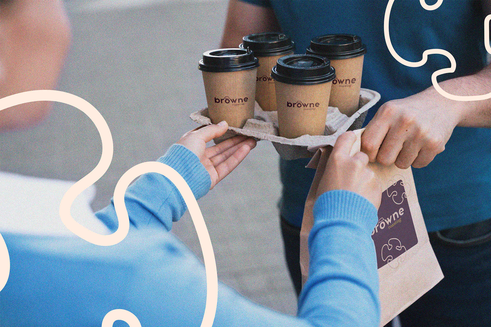
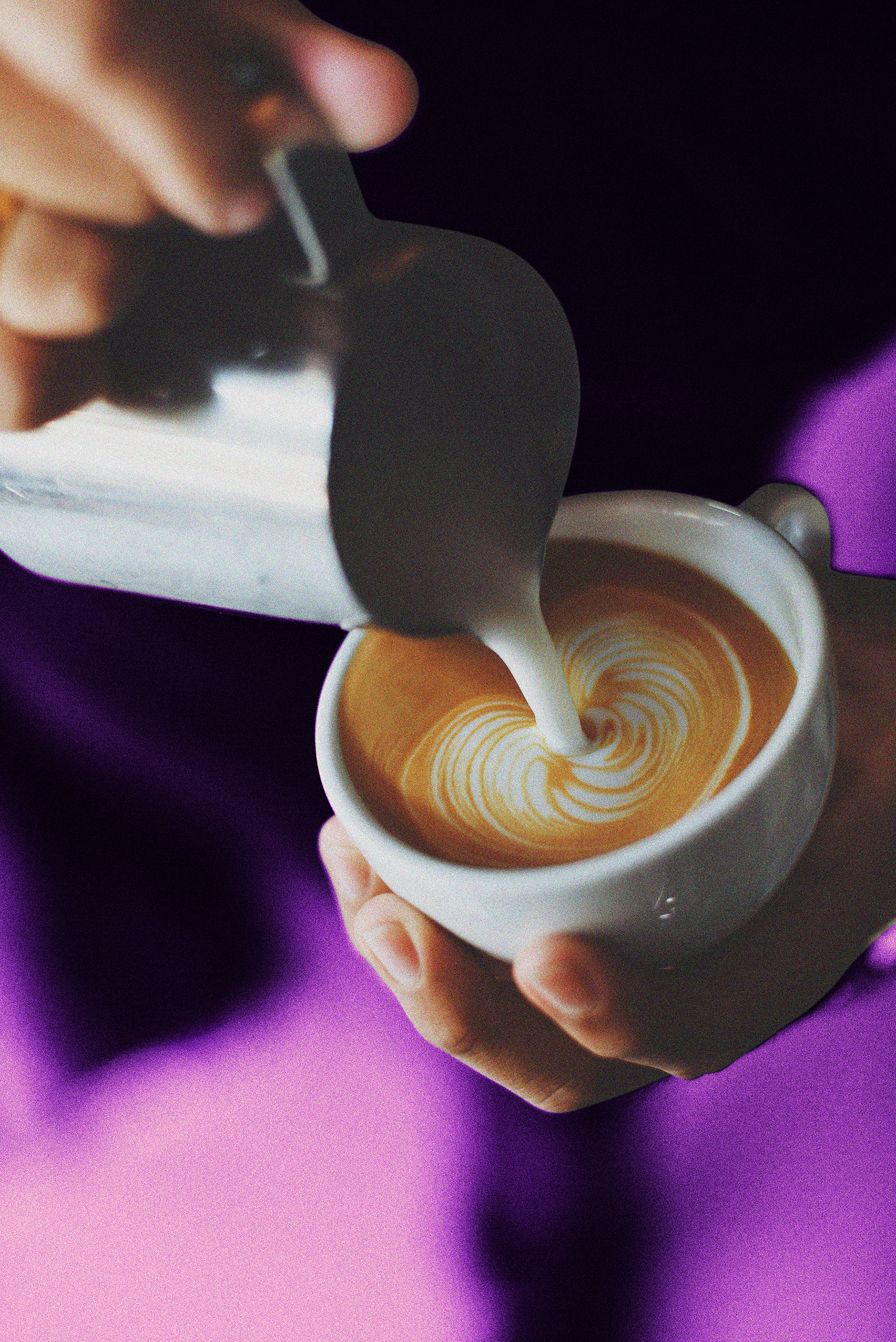
Case: Browne Roasting is a small-batch coffee roaster that prides itself on offering the finest quality coffee to its customers. They specialize in sourcing beans from sustainable and fair trade sources and roast them to perfection to bring out the unique flavors of each origin.
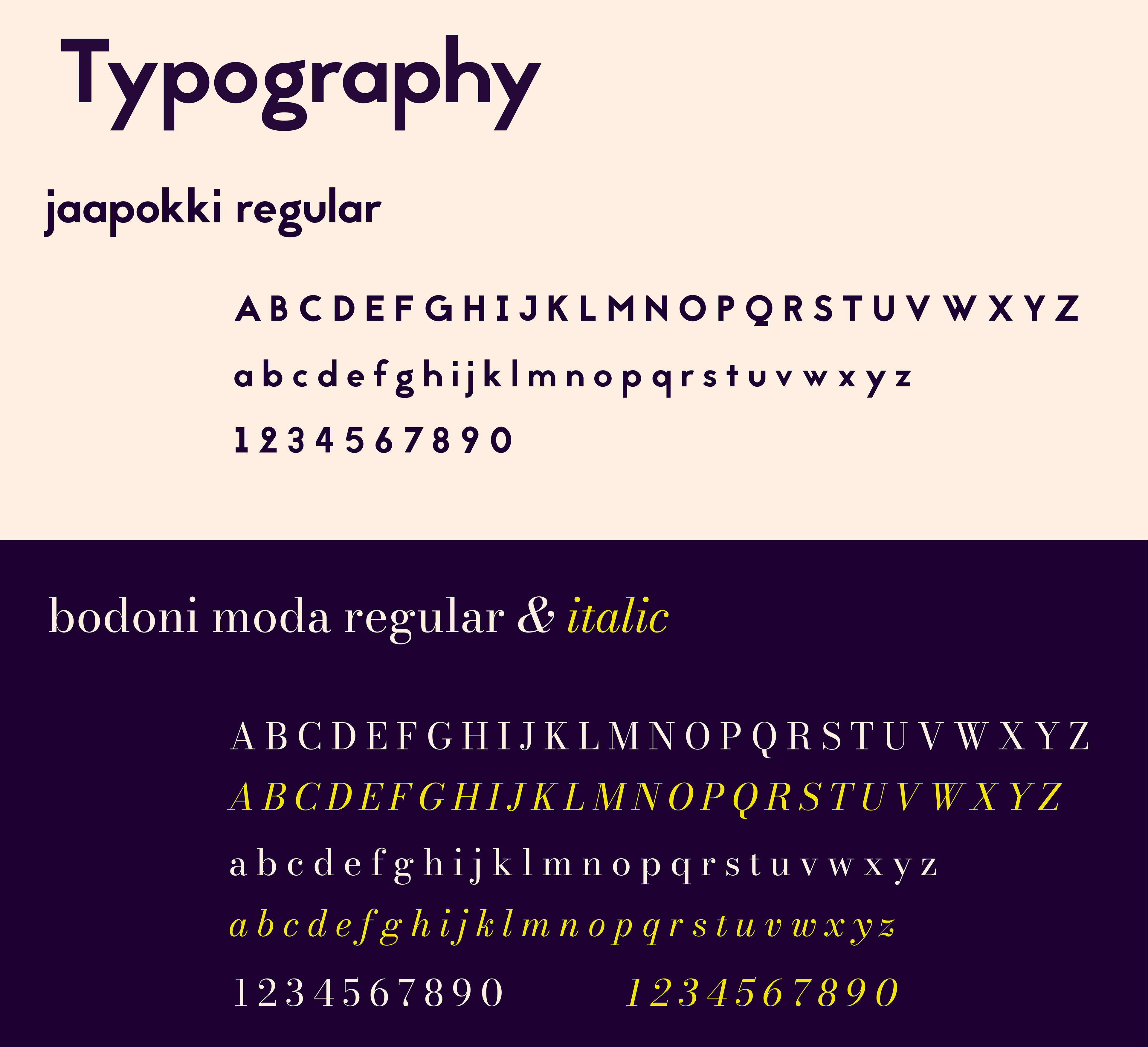
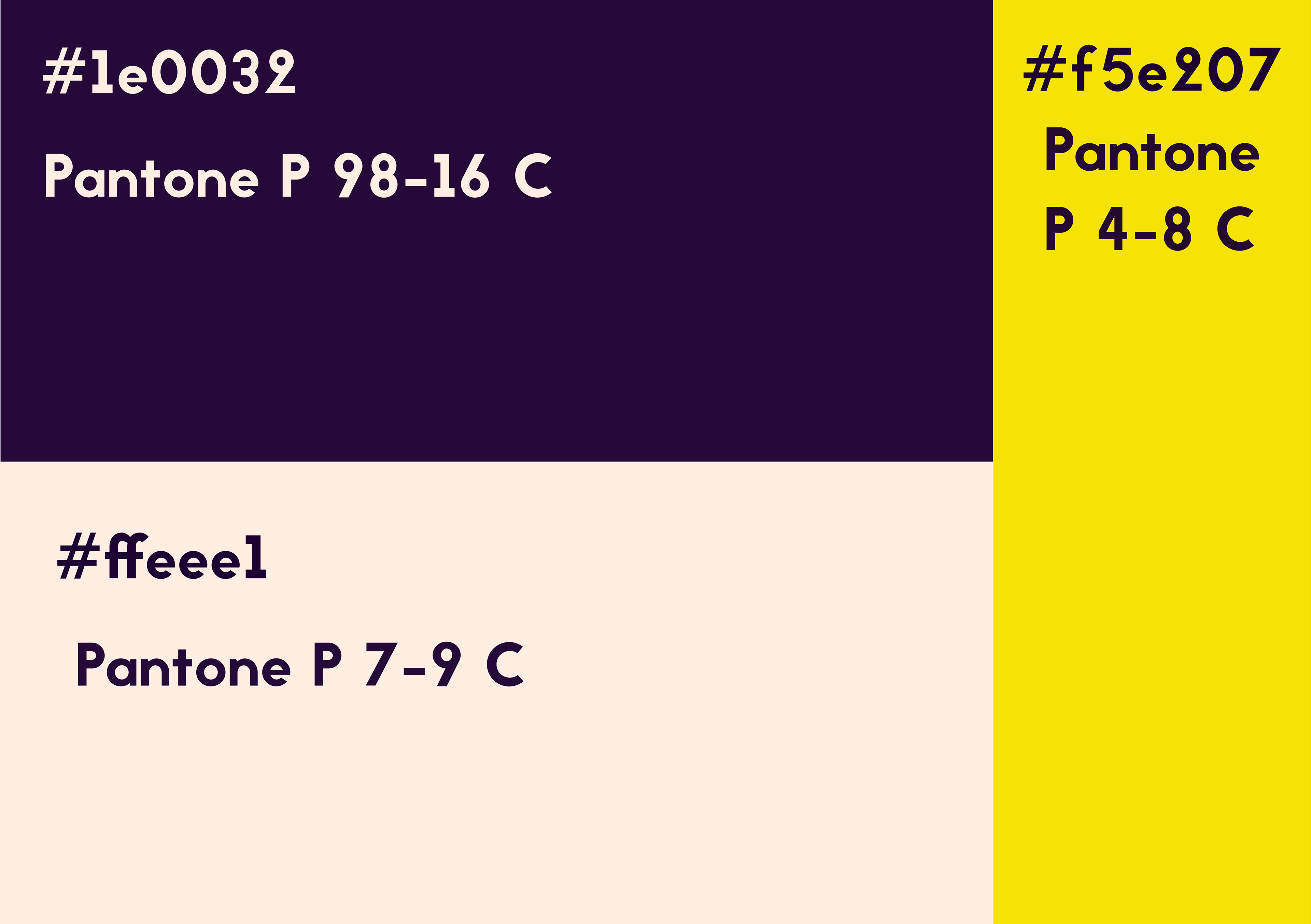
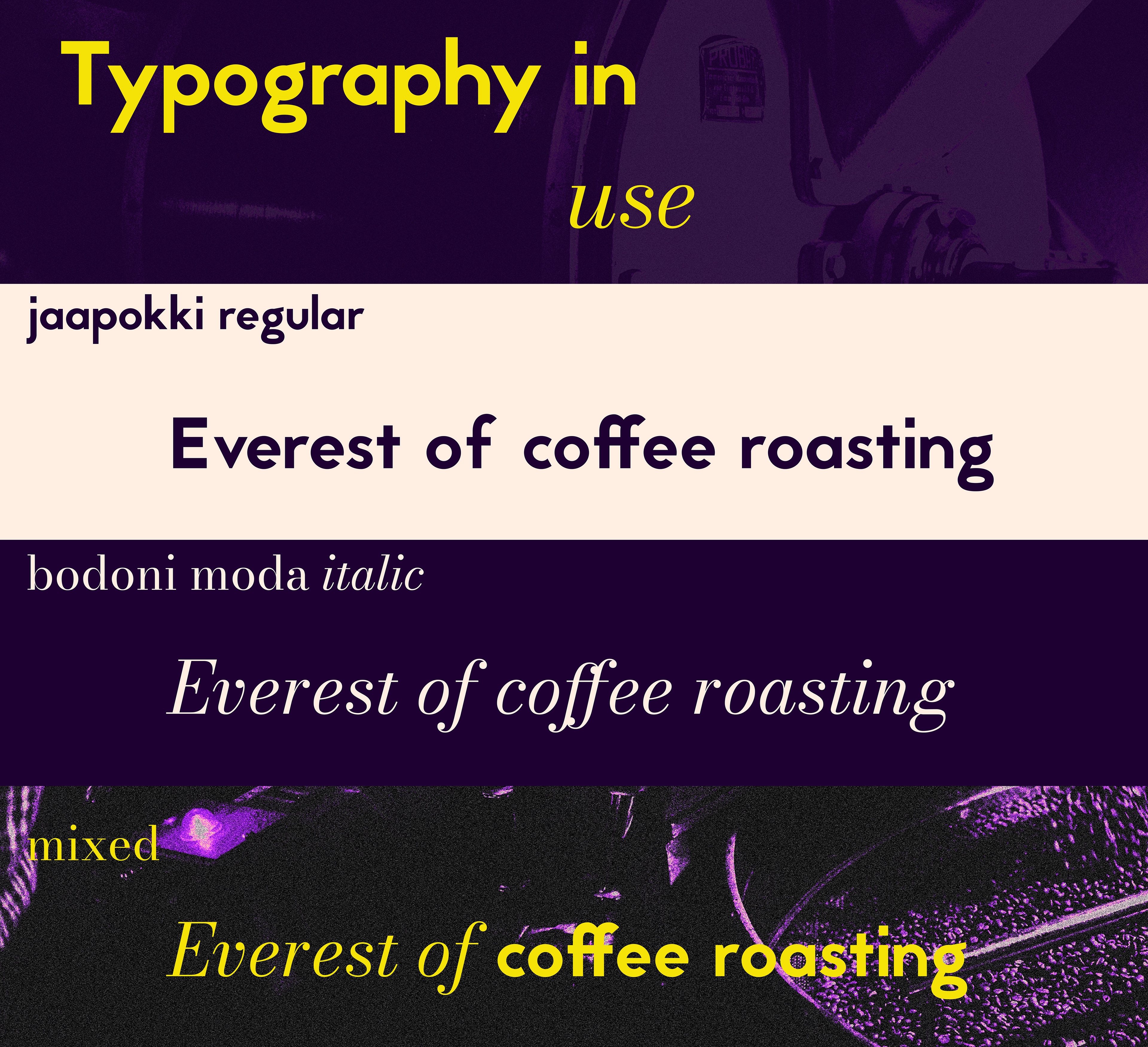
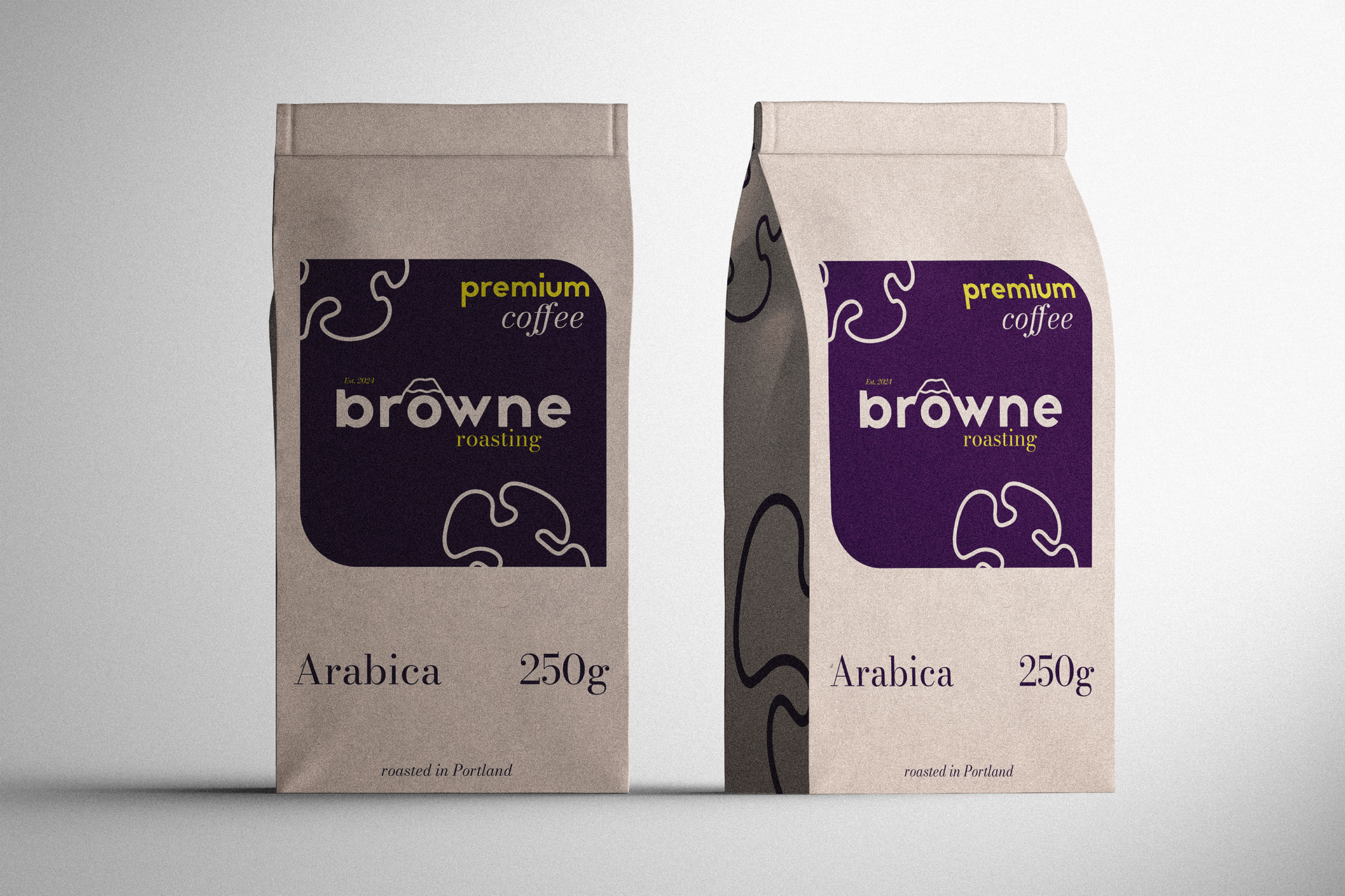
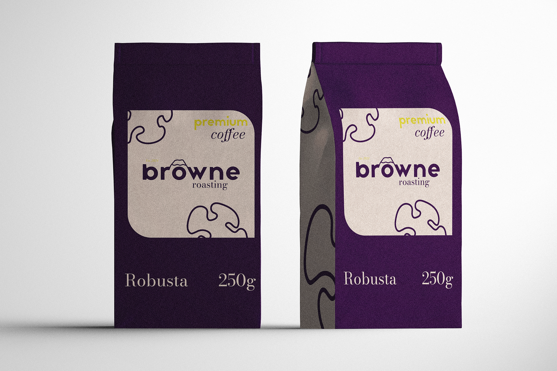
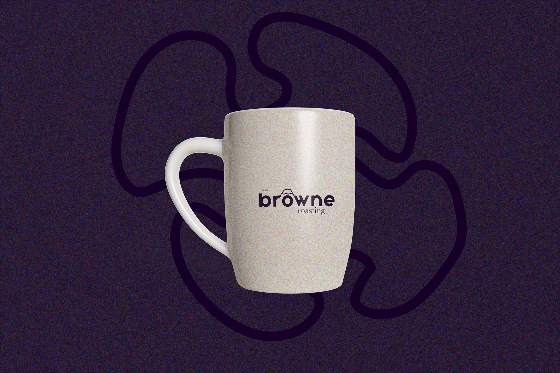
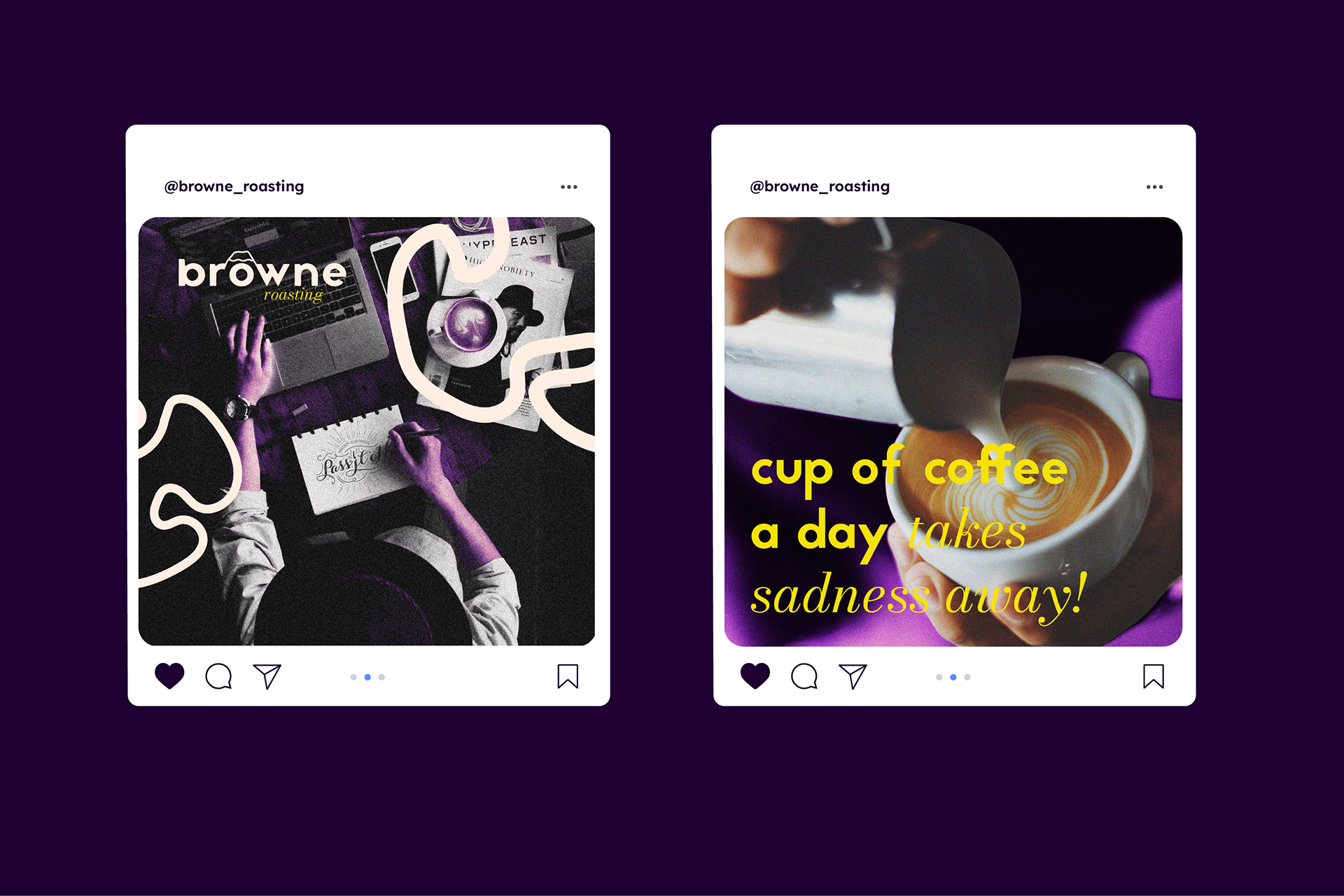
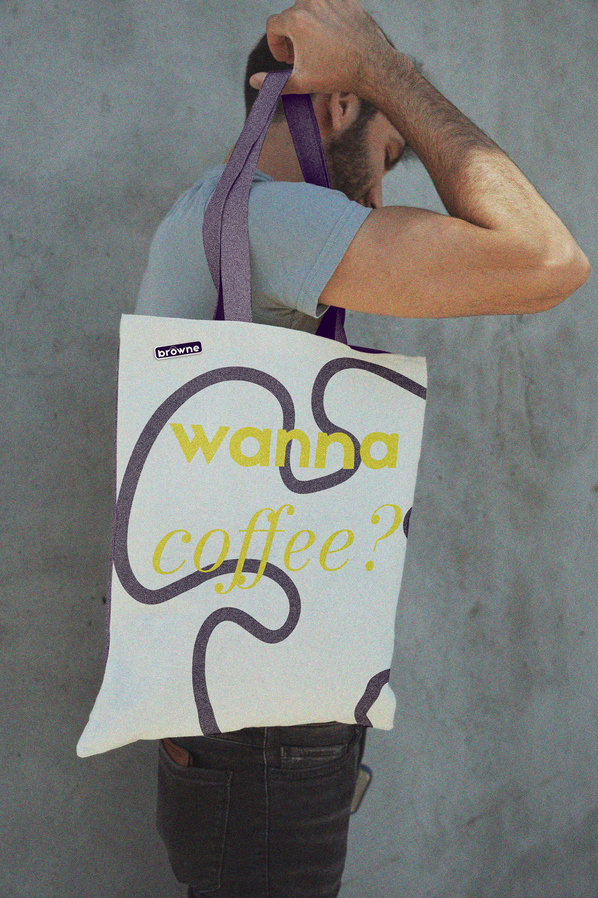
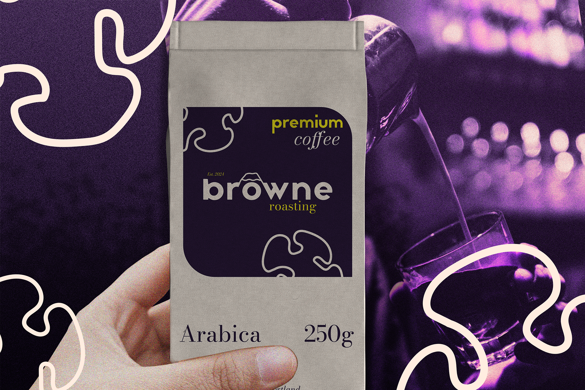
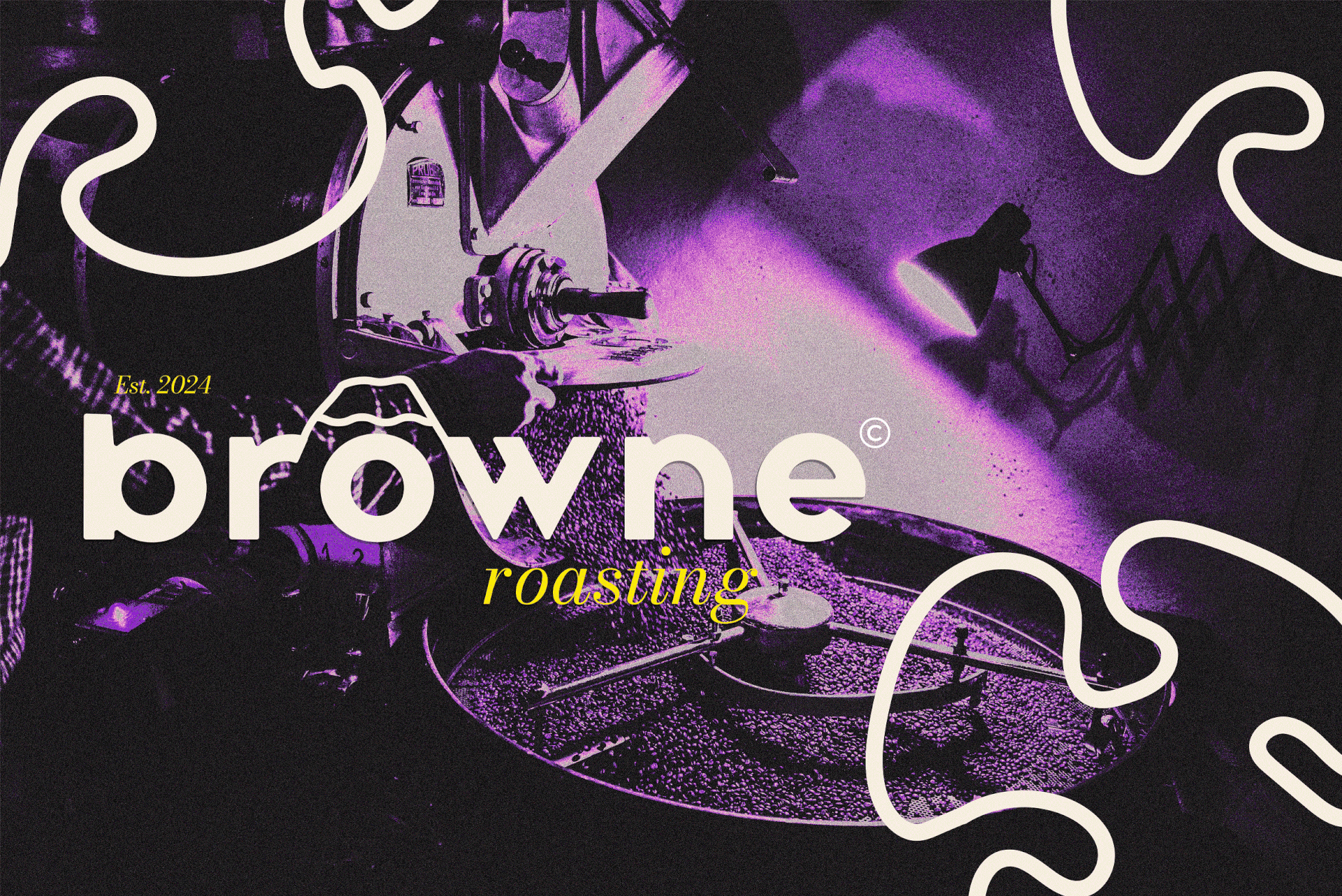
Solution: With my developed design I wanted to reflect roastery's commitment to sustainability and high-quality coffee. Per the client's request, the design should incorporate natural elements, such as mountains, trees, or flowers, and have a modern, minimalist feel.
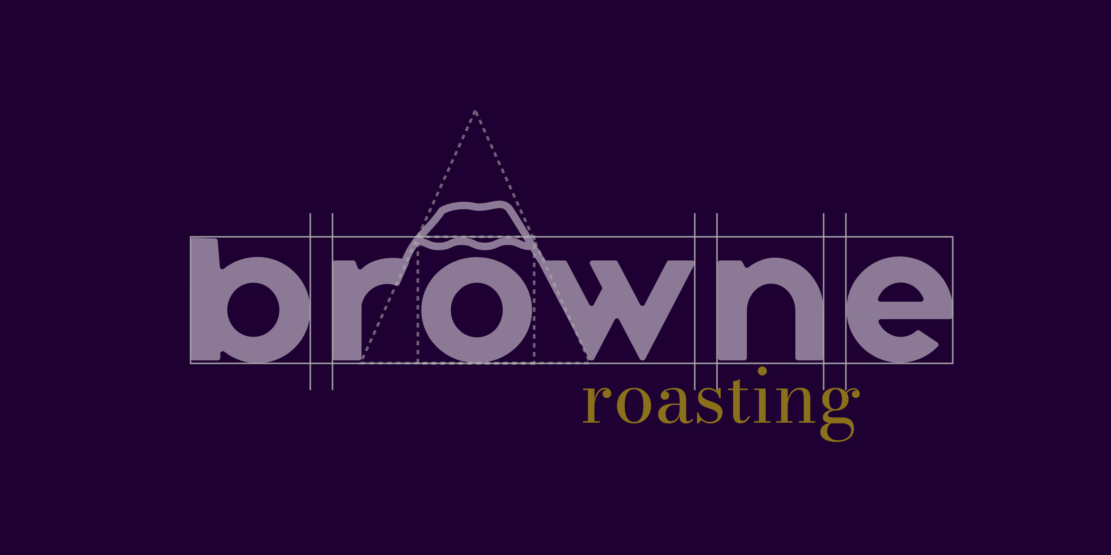
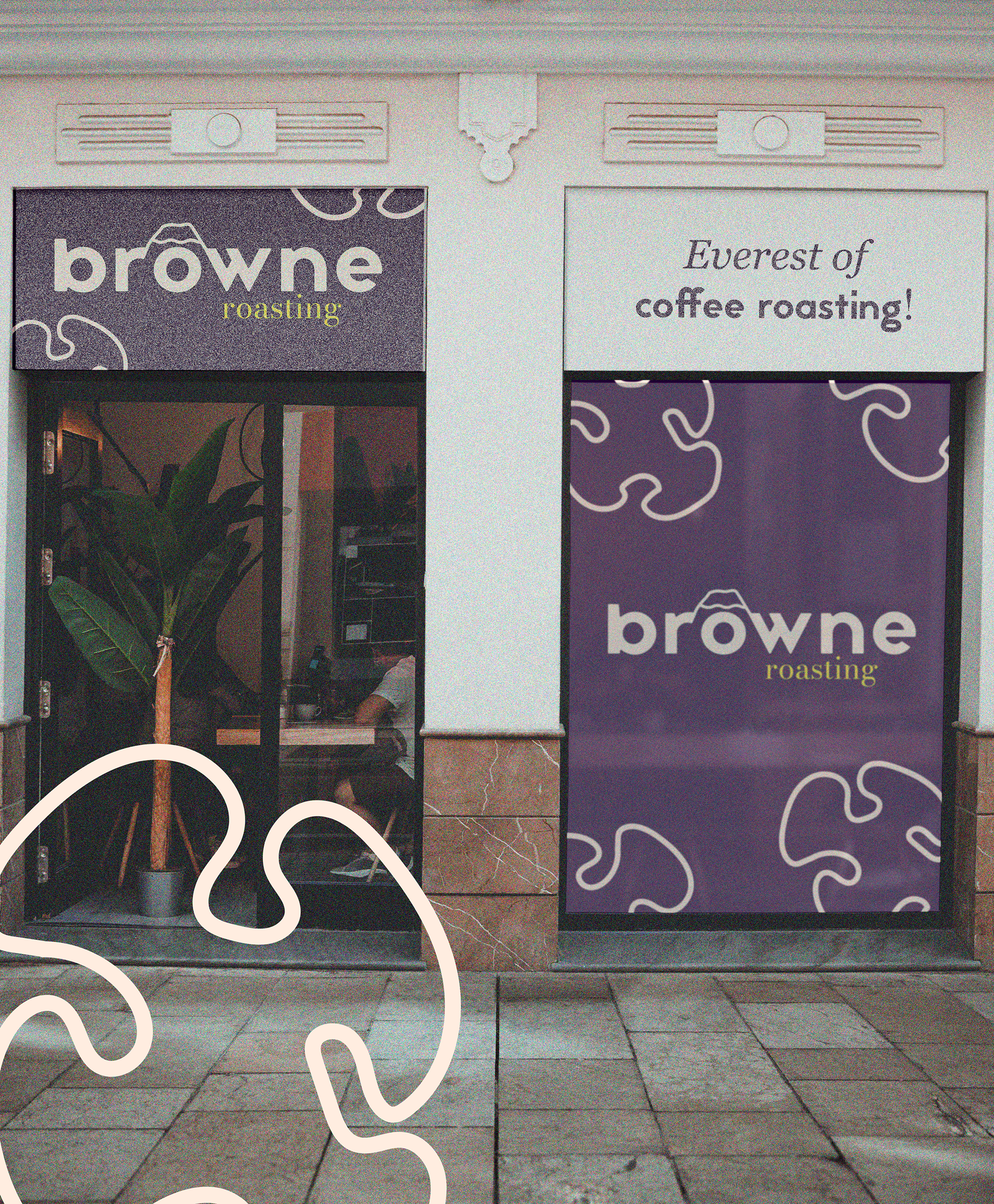
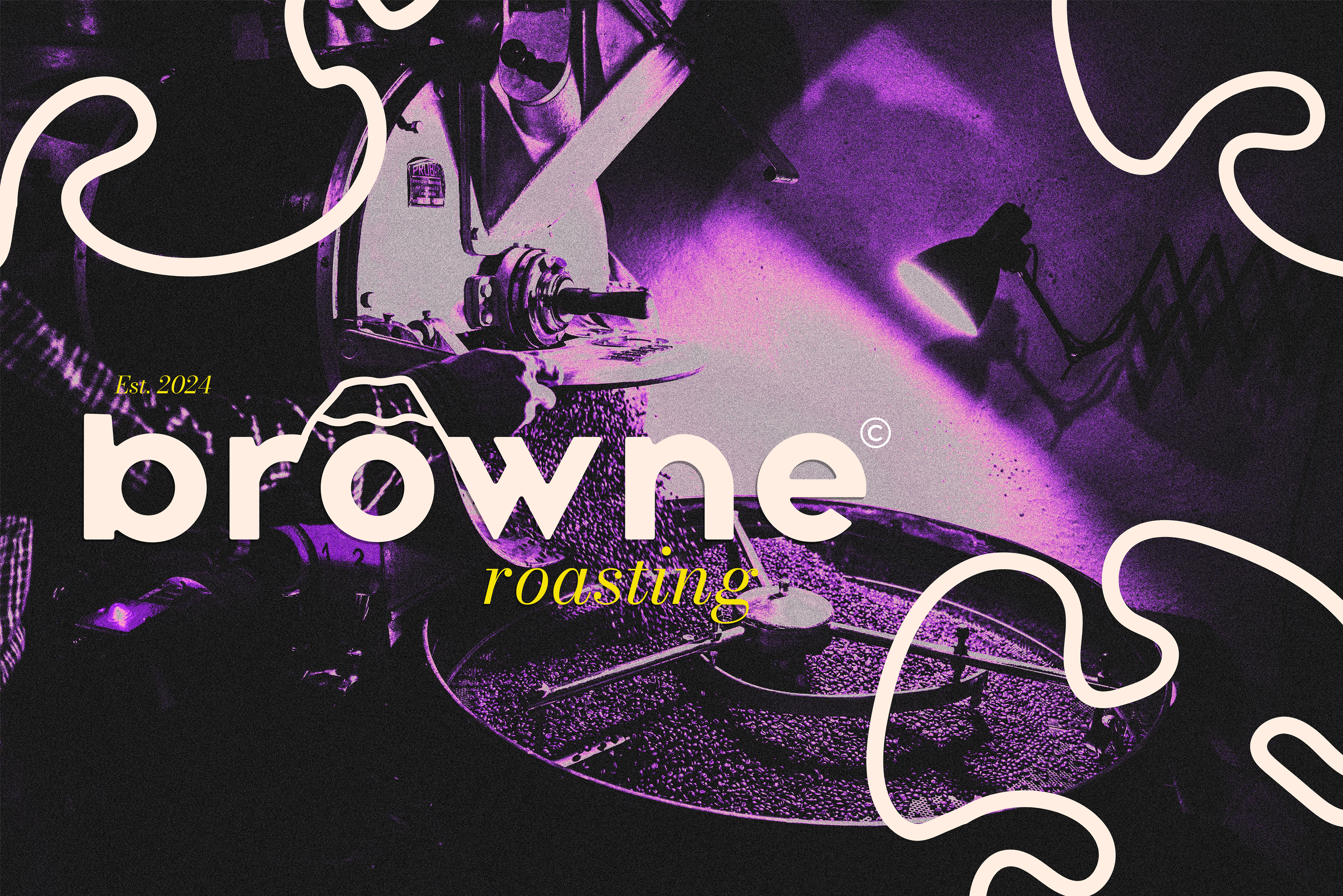
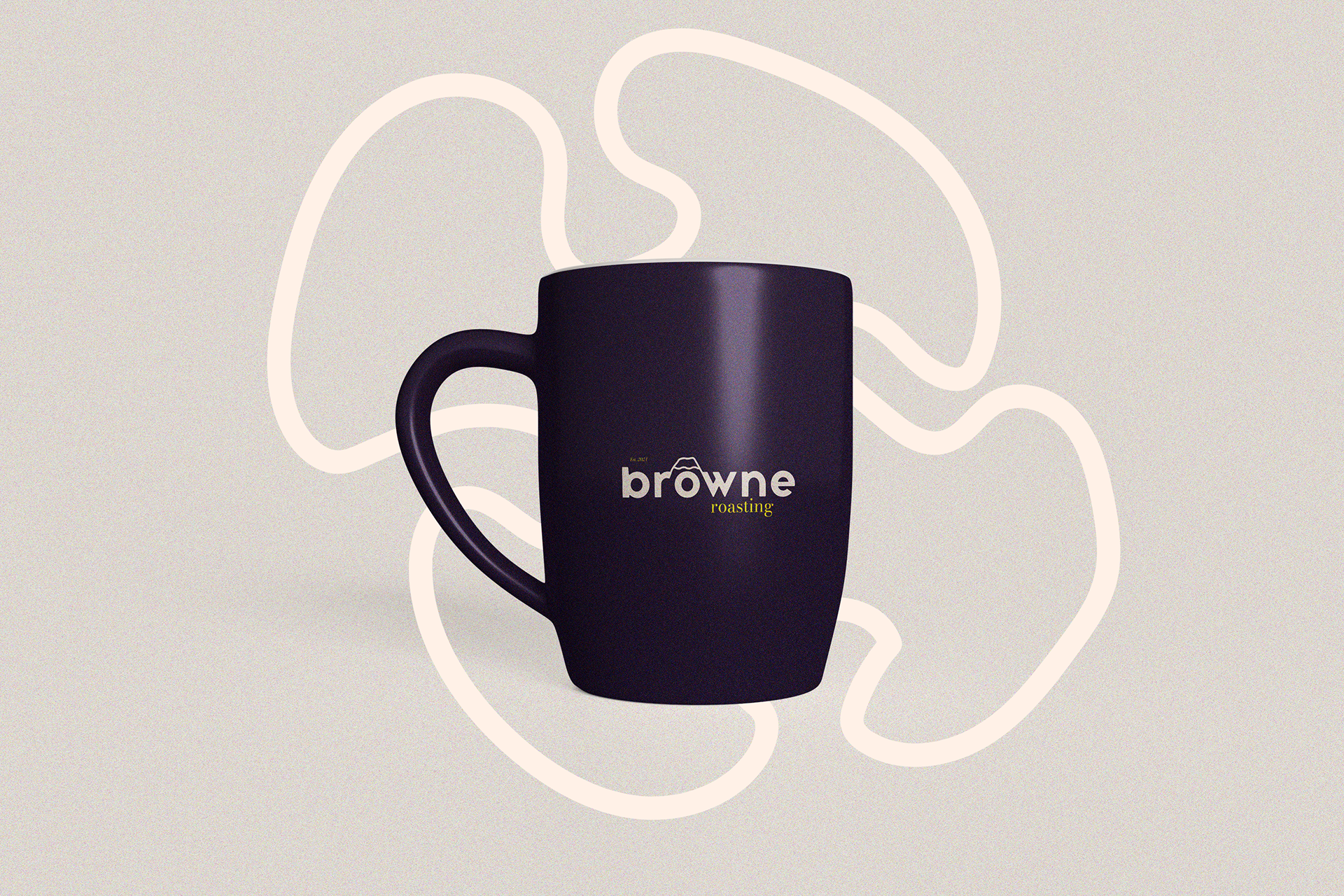
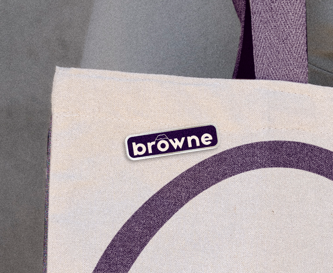
To incorporate natural elements into the design, I introduced a mountain peak into the logo as an homage to Mount Hood, an iconic landmark near Portland where the roastery is located. The mountain peak symbolizes the roastery’s commitment to excellence in coffee craftsmanship, reflecting both the elevated quality of its products and its deep connection to the local landscape.
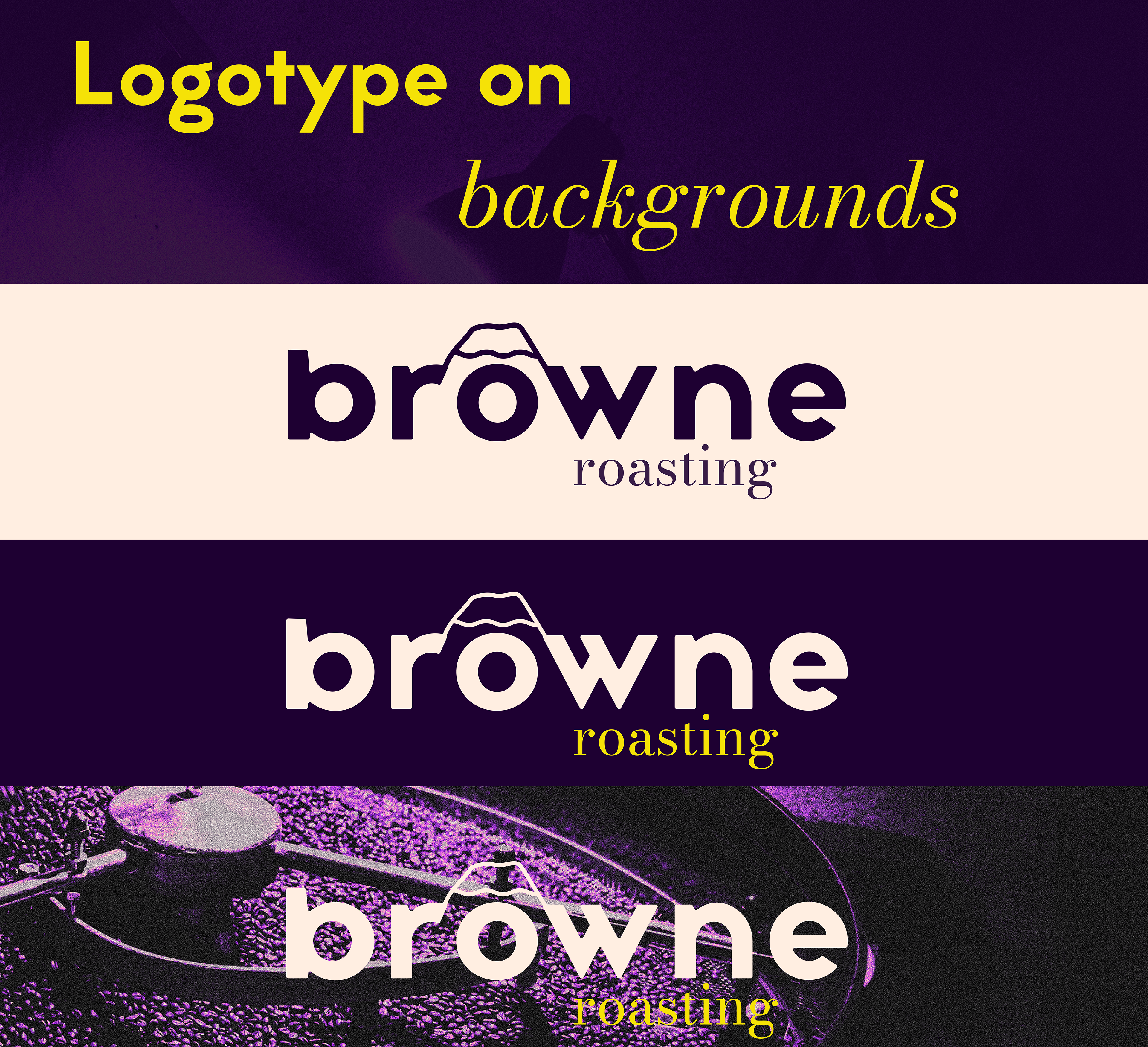
Furthermore, I introduced an organic shape reminiscent of a coffee spill as a complementary design element. This fluid form creates a subtle contrast with the otherwise refined and structured composition, bringing a sense of movement, spontaneity, and youthful energy to the brand identity while maintaining its premium aesthetic.
Thank you